Amazon recently introduced their new checkout here in India. I’m not sure where else they did.

It was such a welcome move for me personally since, as someone with 10+ years of e-commerce UX experience, I have always felt that their checkout missed a few important aspects of the ‘perfect’ checkout experience.
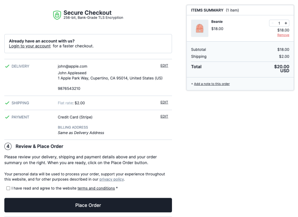
The Accordion-style checkout
Amazon’s new checkout follows what is called an Accordion-style checkout. One of the key concepts of an accordion checkout is to make all the checkout steps individual sections that expand and collapse. There are 2 main benefits to this –
1. It makes it easier for users to review their typings and selections as it is fresh in the memory as opposed to as a lump sum in the last review step. During eye-tracking test sessions of the accordion-style checkout flows, it was clearly revealed that users glimpse at and scan the summaries of their prior steps during the accordion flow – allowing for an ongoing review of their typings and selections.
2. It also allows users to edit the entered information in a seamless way since an ‘Edit’ or ‘Change’ link will generally be available at each completed collapsed step. In Amazon’s previous multi-page checkout, editing can be done only in the review step or by going back to that step one by one using the browser back button.
How Amazon got their implementation right
1. Animate step changes –
When using an accordion checkout, there are a few inherent usability issues that have to be actively dealt with by following these implementation details –
To hint at the accordion concept, transition effects should be used to animate the concept of the current step collapsing into a summary, while the next expands to reveal new form fields.
What they got right: When submitting a step, Amazon uses an expanding animation to display the next step.
What they missed: To perfect this implementation, when submitting a step, it should collapse into it’s summary with an animated transition effect before the next step’s expand animation is initiated.
It is important that the expanding transition of the next step and the collapsing transition of the current step are chained one after the other instead of running simultaneously to clearly communicate the accordion concept to the user.

2. Ensure back button behaviour aligns –
If a new view is sufficiently visually different, or if a new view conceptually feels like a new page, it will be perceived by users as a new page – regardless of whether it technically is a new page or not. This is particularly important to be mindful of in accordion checkouts that submit each checkout step without a page reload (as in the case with Amazon)
What they got right: Amazon has ensured that the browser back button takes users back to the previous viewed step even if it’s technically the same page
3. Use a sticky order summary
What they got right: As the customer scrolls down and advances through the checkout, the Order Summary sticks to the top of the viewport. This persistent view of a summary is helpful for the ongoing review of changes in price values due to their typings and selections. This will communicate to the user that any price changes are due to their direct actions.

How I’d improve the new Amazon checkout
Better form submission button association
The actual checkout form is on the left column while the button for submitting that form is on the right column. Users, being used to the web standard of placing the submit button below the form, will find this confusing. I’m assuming Amazon might have done this for 2 reasons –
1. To be consistent with the position of the secondary Place order button in the right column (to make sure users do not mistake the final review step for the order confirmation page). But moving all step submission buttons to the right creates dissociation from the form.
2. With the right column fixed to the top when I scroll down, they might also have done this to keep the buttons visible at all times in case of a lengthy form which will push the submit button below out of the viewport. If so, they can easily implement a button that sticks to the bottom when it goes out of view.
I’m particularly glad about this new change as I have been a proponent of the accordion checkout. The Linear Checkout for WooCommerce plugin also uses an accordion checkout for the very same reasons mentioned above.