Mobile e-commerce traffic has exploded recently and frequently constitutes 40-60% of all traffic to many e-commerce sites. A study by the Baymard Institute shows that 43.2% of all smartphone or tablet users have abandoned an online order during the checkout flow.
That’s why we built the mobile-first checkout flow from the ground up based on 55 mobile-specific guidelines to offer the best mobile checkout experience ever.
Below let me explain a few of them.
# Field labels must be understood when read entirely out of context
Users generally tend to view each form field as a separate task to be completed without having the broader context in mind. For eg., when filling out the street address in the billing address form, not all users are aware that they are, in fact, filling out the street address for the billing address and not the delivery address. This should come as no surprise given the very limited screen real estate. Furthermore, the touch keyboard that appears when users fill in form fields further reduces the viewport to less than half its size.
Since you cannot rely on mobile users having enough overview of the page to fully understand the field and label context, the field labels should make sense when read entirely out of context.
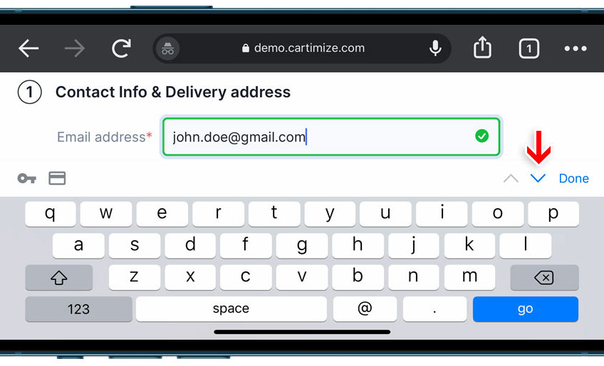
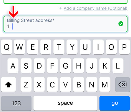
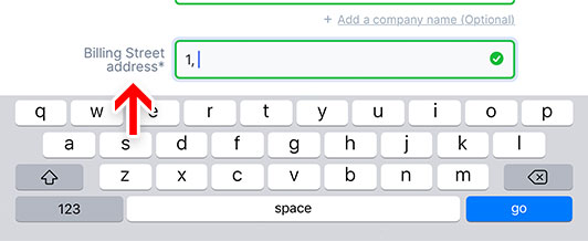
This is why we add a context-setting prefix of “Delivery” and “Billing” to the form field labels of the respective address forms in the mobile view.
# Dynamically change label position in landscape mode
The keyboard in landscape mode severely limits the actual viewable area. While some users prefer to type forms in landscape view due to the much larger keyboard, they also experience severe usability issues with the lack of site overview when filling out forms. The very small viewable area leads to vital context-setting labels (we use top-aligned labels to allow for full-width text fields on mobile) being lost when the field has to be filled.
To solve the issue of the field label being out of view, we dynamically change the preferred label position from above the field in portrait mode, to the left of the field in landscape mode (that is, placing the label at the same line as the field).
In this context, it is also important that users can move to the next field using the ‘Next’ and ‘Previous’ buttons on the keyboard. Read more in the ‘Honor the Next and Previous button behaviour’ section further below.
# Horizontal payment method selector with nudge animation
To explain this better, I need to first explain a bit about our ‘Tabbed payment methods selector with default selection’ interface and how it’s better than the WooCommerce default checkout’s payment method selection interface.
This is how the WooCommerce default checkout’s payment method selection looks.
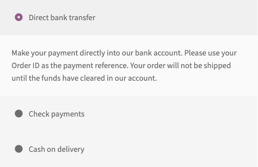
Even though it’s great for your customer to have the first option (the most-used option that is placed at the top in WooCommerce payment settings) selected and open by default, this presents another problem. Radio buttons that have nested options or information tied to each of the selections are prone to proximity issues because the size of the associated information and options push the radio buttons farther away from each other.
If radio buttons aren’t right above or next to each other, it’s likely that users won’t understand or notice that these options are related. Proximity is crucial in indicating if elements are related or not, and, since radio buttons only make sense in the full context (where users can see and compare the entire set of options at once), they should always be close to one another.
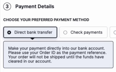
This is why we show the payment method selector’s radio buttons one below the other while also having a default selection.
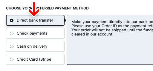
And, of course, in mobile, we use a horizontally aligned selector with the radio buttons right next to each other to maintain the proximity. However, this presented us with an entirely new problem: when there are more than 2 or 3 options, they tend to go out of the viewport. This situation of having more options as part of a horizontally scrollable list is usually addressed by making sure the options get visually cut-off so that the user knows that there are more options on the right.
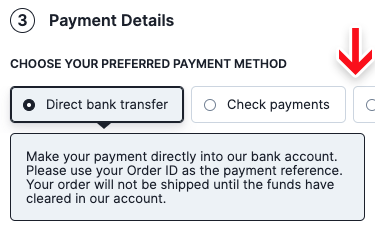
But if the last visible option ends just before the right edge of the viewport, the next option is not visible, and users have no way to know there are more option on the right. This is why we run a continuous nudge animation to communicate that there are more options to the right. This animation will run until users interact with one of the radio buttons or the content of the first option that is open by default.
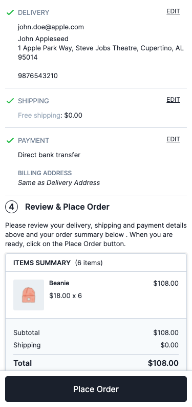
# Sticky place order button in review step
According to a study by The Baymard Institute, 11.6% of users misinterpret the review step for a confirmation step. As a result, they left the checkout without placing the order. Adding to the tragedy, these users did so in good faith believing that their order was successfully placed.
This misinterpretation is often caused by 2 factors –
1. The user just submitted their payment information in the previous step and assumes the order will be placed consequently.
2. The fact that the review step and confirmation step often look similar with the same set of data being displayed to the user.
The only element that is sure to distinguish the two steps is the presence of a persistent “Place Order” primary button at the review step.
# Touch keyboards
An important part of making filling forms on mobile less frustrating is presenting the right keyboard types and optimizing form fields for touch keyboards.
# Show appropriate keyboard layouts
Based on the type of input being requested, the appropriate mobile keyboard layout is invoked.
For example, an email keyboard is invoked for the email address field, a numeric keyboard for the postcode field and a phone keyboard for the user’s phone number field. This saves the user from switching from their traditional keyboard layout. In the case of numeric inputs, it minimizes typos as these specialized keyboards have much larger keys that reduce the chance of accidental taps.
Let’s look at a few of them in detail.
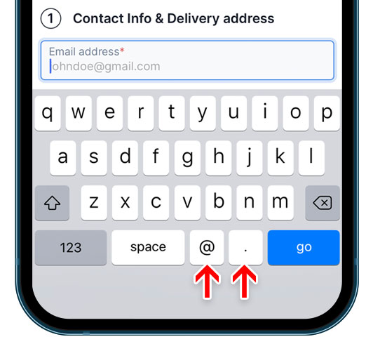
Email Address: The keyboard layout invoked when the user enters their email address includes the “@” symbol as well as a “.”
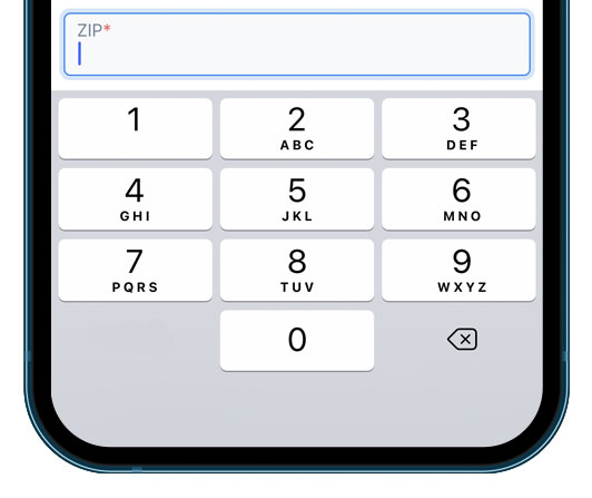
Postcode: A numeric keypad is invoked when the user enters their postal code. However, a few countries like Canada and the UK use alphanumeric postal codes. For those that do, we show a standard keyboard layout.
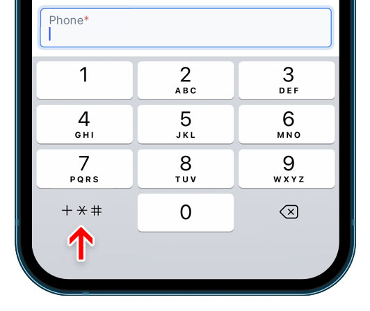
Phone number: A numeric keypad with an option to add a few special characters like +, * and # is invoked.
# Disable auto-correct where appropriate
Auto-correct often works very poorly for abbreviations, street names, email addresses, and similar words that are not in the dictionary. One of the major issues relating to auto-correct was that users often fail to notice the correction (as they are often focused on what they are typing instead of what they have typed). This is fine if the correction is correct, but it can be detrimental if it is wrong.
So we disable auto-correction on the email, name and address fields.
# Disable auto-capitalization where appropriate
The default behaviour on smartphones is to auto-capitalize the first letter in standard text fields, which is generally desired. However, in a few cases, it’s better to disable this auto-capitalization since the user will want to enter lowercase values. This is especially true for the email address field where most users would want their input to be in lowercase.
# Honour the ‘Next’ and ‘Previous’ button behaviour
The ‘Next’ and ‘Previous’ buttons in the mobile touch keyboard essentially function as the mobile version of keyboard tabbing and therefore they should adopt the same sequential principles as the desktop tabbing sequence. This makes it a fast way to get from one field to the next without having to use a pointer (be it a mouse or finger). This is particularly important on mobile since the screen real estate is so limited when the keyboard is open that the next field may be partially or even totally (in landscape mode) obstructed, making the “Next” button even more convenient to use.