Simplifying Checkout Forms to Avoid an Overwhelming appearance
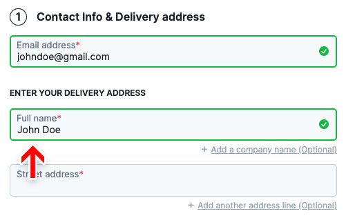
Use a Single ‘Full Name’ Field
Hide ‘Company Name’ behind a link
Country should be auto-detected using visitors’ IP address
Hide second ‘Street address’ field behind a link
Auto-Detect City and State Immediately After ZIP-Code is Provided
Explain why you need the users’ phone number
Hide Order Notes field behind a link
Inline error validation of form fields
Woocommerce has an incomplete inline error validation implementation
Benefits of Inline Validation
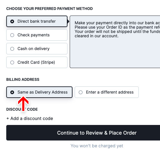
Use ‘Shipping Address’ as ‘Billing Address’ by Default
‘Billing = Shipping’, Not the Other Way Around
‘Delayed Account Creation’ in the Guest Checkout Flow
Removes friction
Opportunity to encourage users to create an account
Make Guest checkout the most prominent option while also allowing members to login easily
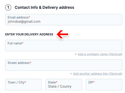
The Woocommerce checkout is a one-step checkout, meaning it shows users everything they have to complete up-front. Users are therefore given a clear promise of “you are done once you complete what you see here” – this is unlike accordions and multi-step checkouts that only hint at what’s coming next through their process steps.
However, the benefit of seeing everything, in practice often also turns out to be one of the main issues that we observe when testing one-step checkouts. Because everything is shown in one single step, that page will contain a lot of form fields and can therefore often be perceived as being very intimidating.
While important to all checkouts, minimizing the default number of displayed form fields and selections are particularly important for the Woocommerce one-step checkout implementation. It’s key to achieve the perceived simplicity that the one-step style can afford.
Simplifying Checkout Forms to Avoid an Overwhelming appearance
Use a Single ‘Full Name’ Field
Users generally think of their name as a single entity and, therefore, a large proportion of users often type out their full name in ‘First Name’ field. In a checkout usability study, 42% of test subjects typed their full name in the first name field, at least once during testing. Only as they progressed through the form did they notice the ‘Middle’ or ‘Last’ name fields and go back to correct the error.
Fiddling with the name fields isn’t the most severe of issues. No user abandons the purchase due to two name fields and only few actual form field errors were observed during testing. Users notice their mistake and correct it before proceeding, hence the issue won’t show up in most web statistics either. What this issue doesn’t have in severity, it does however have in frequency. While only few of these subjects got validation errors, all the subjects were interrupted and had their typing flow broken. Given the simplicity of the task “type your name” the needless friction is quite significant.
The solution is however relatively straightforward. Acknowledge users’ tendency to think of their name as a single entity by implementing a single “Full Name” field. When testing sites with a single “Full Name” field, comparably only 4% of subjects briefly hesitated before typing in their full name, and no one had the kind of typing or interaction issues observed in the multi-name-fields approach.
Besides supporting users’ tendency to think of their name as a single entity, a single name field also solves some of the issues regarding additional name fields. When using first and last name fields users can become in doubt as to whether middle names are needed, and where to put them. This issue is alleviated by a single full name form field, as users can write their name exactly as they please or how it’s printed, for example, on a credit card.
Using a single “Full Name” field will at a minimum cut the number of form fields by one. As the average checkout flow consists of 14.88 text form fields, this translates to a ~7% reduction of the form fields presented to users – an initial step in reducing how intimidating the checkout step will be perceived.
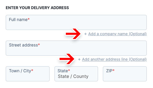
Hide ‘Company Name’ behind a link
While Company Name fields are mostly optional, optional inputs presented as open text fields demand a disproportionate amount of attention, as users still have to notice that the field is optional and deduce whether or not the field is irrelevant for them.
The solution is to simply hide the Company Name field behind a link. As importantly, on the sites that provided a link to reveal the Company Name field, the eye-tracking testing revealed that all subjects noted the links before moving on or engaging with them. This is a crucial detail, as the sub-set of users who do have a use for a Company Name need to be able to spot the link.
Country should be auto-detected using visitors’ IP address
Users generally want to type as little as possible, and helping them out by pre-defining values is generally observed to perform well, as described throughout this chapter. A specific variation thereof is relying on the user’s IP address and its inferred location to set the shipping country value.

Woocommerce actually does this well. The user’s country is pre-filled by default both in the shipping calculator module in the cart page and in the checkout address form.
But it’s not just about pre-filling the value of the single country field when we use IP geo-targeting as much as it is about showing the right set of form fields, labels, options, and checkout steps to users the first time around.
Besides meeting user expectations, the most important usability benefit of geo-targeting the user’s country value is that it will often directly control the availability of other checkout options, including the following:
- Typically the availability of fields such as “ZIP”, “State”, and “Region” depends directly on the country chosen.
- The field labels themselves can be country specific to match local regional naming – for example, “ZIP Code” vs. “Postal Code”, or “State” vs. “Region” vs. “County”.
- Some field features may only work for certain countries. For example, state and city auto-detection based on the typed ZIP code may be a feature only supported in the site’s key markets.
- The selected shipping country will often also change the shipping cost and tax. A total order cost estimate should be provided as early in the checkout flow as possible, ideally in the cart. Using geo-targeting allows e-commerce sites to show more accurate order costs earlier in the checkout flow.
- Form field validation rules may change based on the country – which particularly for live front-end validation may require that we know the country upfront.
Hide second ‘Street address’ field behind a link
Writing an address is relatively straightforward for most users, yet, during testing, subjects were often observed to be confused by the second “Street address” field, which made 30% of the subjects come to a stop, and furthermore made some question if their first “Street address” input was correct.
As with the company name, the second Address fields, which are always optional, presented as open text fields demand a disproportionate amount of attention, as users still have to notice that the field is optional and deduce whether or not the field is irrelevant for them. Besides the high amount of focus, the most commonly observed issue with the second Address field during usability testing sessions is field ambiguity, with subjects often wondering if they should type all information in Address Line 1 (street name, number, apartment floor, apartment number, etc) or divide it, following the logic that “Two form fields, two inputs”. The presence of a second Address field can therefore unintentionally confuse users who don’t have any use for it.
The solution is the same as that for Company name field. Hide the second Address field behind a link. By only permanently displaying the first Street Address, users avoid second guessing their initial input, as there’s no immediate option to divide the address line. Besides reducing ambiguity and speeding up typing, an additional bonus of hiding the second Address field is showing one less form field by default, making the step feel less intimidating.

Note: Hiding the second Address field behind a link is naturally only advisable if the majority of site customers do not need it. If a significant amount of the site customers do need the second Address field, it should be permanently visible as a form field. If in doubt, it’s advisable to run a custom analysis of the current order data to gauge the usage, but also analyze the type of usage (the amount wrongly submitted the second Address data).
Auto-Detect City and State Immediately After ZIP-Code is Provided
Typing information in form fields is generally one of users’ least favorite part of online shopping. While we can’t avoid requiring some information from users, we should minimize the amount of typing required whenever possible. Both “State” (/region) and “City” inputs present such an opportunity, as both can be auto-detected from a ZIP or postal code in most countries.

Besides minimizing the amount of typing, auto-detection also means that users avoid typos and misspellings, particularly for the ‘City’ input, hence reducing the amount of validation errors or potential delivery issues. During testing, typos and misspellings were quite common when subjects were tasked with typing information into text form fields, e.g. a city name. Either because they couldn’t spell the word or, just as common, due to simple typos. This resulted in a number of validation errors, which could have been avoided with auto-detection, as fewer user input fields simply means fewer opportunities for the user to type incorrectly.
Explain why you need the users’ phone number
Users continue to be concerned about the security and confidentiality of their personal information on the web. This can range from serious concerns over identity theft to more mundane concerns, such as an aversion to receiving marketing phone calls – making them reluctant to hand out personal information.
To avoid privacy issues and fake data being submitted, reconsider how important the dataset is – when and how often is it actually used – and then consider making the field(s) optional. This will alleviate the privacy concerns for the vast majority of users who can simply elect not to provide the information.
When it’s truly necessary to require users to supply the information, it should clearly be explained why the data is required. One well-performing pattern is simply using a short inline explanation, in close proximity to the field, such as “Used for payment validation”, “For order questions only”, or whatever the information is actually used for.

Hide Order Notes field behind a link
Similar to hiding the Company name field and the second Address field, hiding the Order Notes field behind a link results in showing one less form field by default, making the step feel less intimidating.

Implementing all the above stated simplification strategies, the original Woocommerce checkout’s visual length and the number of form fields are reduced by half.

Inline error validation of form fields
We time and again observe that there’s a direct correlation between how and when users are presented with form validation errors and the pace and effort with which they are able resolve those errors.
While the logic and wording of error messages are very important aspects of the user’s validation error recovery experience, in order to perfect the user’s recovery experience, live inline validation must be used. “Live inline validation” is where the validity of the user’s inputs are checked live as the user progresses through the form, as opposed to checking the inputs in a lump sum when the user submits the form.
Woocommerce has an incomplete inline error validation implementation
Erroneous fields are simply given a red left border without any error message specified.
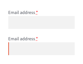
With this example of an email field, there is no clear indication of the error for the user to understand. If the error message is presented in context, spatially close to the field, the user will be able to rectify the error immediately before pressing “Place order” button.

But in our Woocommerce checkout, error messages are displayed out of context, together at the top. This adds considerable cognitive load to users since they now have to review the error list one by one and fix them.

Benefits of Inline Validation
- Locating errors is easier.
Users are told about the error immediately, meaning that they won’t to the same degree have to come to a full stop on a dedicated error section, to try to figure out where the error is. With live inline validation, users are alerted to errors immediately, and the process of locating the error is thus significantly simplified. - Field context is fresh in mind.
Because users are alerted to the input being invalid right after typing it, the amount of time needed to correct it decreases significantly, as the input and its context are still fresh in the user’s mind. On a normal after-the-fact error page, the user will often have to recall the field context and re-read their input since it can be several fields and minutes ago the user read the field label and entered the invalid field value. - Positive inline validation increases confidence.
If positive inline validation is used, then even users without any invalid input will benefit. Positive inline validation removes some cognitive load from users since they don’t have to review and validate the form for errors before submitting it. Instead they can confidently proceed to the next field, resting assured that their input is valid. Positive inline validation can furthermore instill a sense of rapid progression and accomplishment as the user “successfully completes” each field and the site provides them with encouraging visual feedback. - Less likely to unintentionally skip required fields.
In addition to making sure that inputs are valid, inline validation is also efficient for highlighting omitted required fields as users tab through the form. With inline validation in place, users are notified immediately if users tab through a required field without entering a value – vastly reducing the odds of a user accidentally skipping a required field.

Use ‘Shipping Address’ as ‘Billing Address’ by Default
For most B2C sites, the majority of customers typically order products to their own address. Setting the “Billing Address to equal the Shipping Address”, by default, performs vastly better than either not having the feature or not having it as a default selection.
While Woocommerce offers the option for users to select that the billing address is the same as the shipping address, there is a major change that has to be implemented to improve the overall performance.
‘Billing = Shipping’, Not the Other Way Around
Since more users can relate to what a shipping address is, always ask users to type their shipping address, and then default the “Billing Address to equal the Shipping Address”, and not the other way around, as is the case with Woocommerce.
To clarify, a shipping address determines where the product is being delivered – a straightforward terminology which users have no issues understanding. A billing address, on the other hand, can be used for several purposes. For example, it can be for invoicing purposes, or determine the applicable sales tax in the buyer’s state/country, or to be used to verify the credit card by comparing the billing address to the address tied to the credit card. The uses for the billing address aren’t always obvious to all users who therefore wonder why this is required.
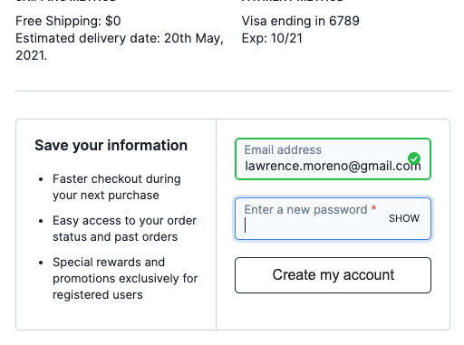
‘Delayed Account Creation’ in the Guest Checkout Flow
While users should always be allowed to complete the checkout process as a guest, having an optional account creation option is often appreciated by users. This begs the question of at which point during the checkout flow is it best to ask for the optional account creation.
Based on previous checkout usability tests, it’s clear that delaying the optional account creation option performs the best. In fact, it’s often best delayed until the order is finalized; hence presenting the optional account creation option on the order confirmation page works best. This concept is called ‘Delayed Account Creation’.
The account creation step in Woocommerce happens when users enter their email address. There’s a checkbox that shows a password field when checked that the user has to fill in.

Removes friction
Any additional point we add in the guest checkout flow is a potential obstacle for users on their road to complete their purchase. More so when users are prompted to enter a strong password to create their account.
With Delayed Account Creation, users won’t have to evaluate or make up their mind about whether or not they should create an account – they can move directly to finalizing their purchase. Generally speaking, any opportunity to delay users’ choices until after the sale has been closed, creates a checkout flow that is easier to complete, and more importantly, feels easy to complete for the end-user.
Opportunity to encourage users to create an account
When delaying optional account creation until after the order has been placed, sites can use a design and wording that more strongly encourage users to create an account.
Make Guest checkout the most prominent option while also allowing members to login easily
It has been a well documented fact for about a decade that not offering a guest checkout option presents major usability issue, causing checkout abandonments at large. More surprisingly the design and placement of the guest option is almost as important as having a guest checkout flow in the first place. On the other hand, it is also important that repeat customers who already have an account, face no issues in immediately finding the sign-in options.
Let’s see how Woocommerce does this. The sign-in form is hidden behind a link that’s placed at the very top of the checkout form while the form for the guest checkout is displayed by default below. This layout where the sign in form is placed at the top but hidden and the guest checkout form is secondary but displayed by default displays a lack of prominence for either and causes confusion for the user.

This issue can be alleviated by using a 2-column account selection step layout, where the guest checkout option is placed on the left hand area. Or as the first option, if the design is single-column layout. This will provide immediate exposure to the guest checkout option, while also allowing registered users to locate the sign-in form quickly and easily.

Make the coupon section much less prominent
Coupon hunting is a major checkout problem because as soon as a users have left the checkout to go look for coupons, the chances of them not returning to complete the purchase increase significantly. Typical causes for not returning to their purchase can be that, during the coupon hunt, buyer’s remorse can set in, the user don’t find a coupon code (and don’t feel like overpaying), or a competing site lures the user in. Showing a coupon code field and apply button directly in the checkout flow is one of the best ways to make sure all users without a coupon notice that they could be getting a better deal on their purchase.
The main component in reducing the amount of needless attention drawn to promotional fields is collapsing the promotional fields (and any apply buttons) behind a link. This performs well, as empty form fields in the checkout are generally seen by users as a potential task that has to be completed, removing the form field from the default checkout flow will greatly reduce the amount of needless attention.
Although Woocommerce hides the actual coupon field and apply button behind a link, both the design and placement of the link still demands needless attention.

Generally, we observe that placing the link above the primary goal of the checkout step, i.e. placing it above the shipping form and payment options, will still cause issues with needless amounts of attention.
Now it’s important to state that when a user does have a coupon or special offer they want to redeem, it should be clear how to do-so, since in some cases it might be the only reason they decided to add items to their cart in the first place. Links for collapsed form fields will get noticed by users actively looking for the option, who will typically scan the page for related keywords.
With Woocommerce powering around 30% of all online stores, it is paramount that all businesses running it implement these suggestions to improve the user experience of the stock Woocommerce checkout. We are positive this will result in a considerable increase in conversion and consequently the revenue.