Linear Checkout for WooCommerce FREE
After you have invested vast resources into building your store and customer acquisition through pay per click campaigns etc., it seems almost unbearable that 69% of users – after having added items to their cart – then choose to abandon their purchase.
Why is it that this many orders are abandoned? And what exactly can online retailers like yourself do to improve this sad state of affairs?
Implement The Best woocommerce Checkout UX and gain as much as a 35% increase in conversion rate, in under 5 minutes.
All design and user-experience decisions are based on 134 checkout-specific guidelines distilled from The Baymard Institute‘s 71,000+ hours of large scale e-commerce UX research. The very same research used by leading e-commerce companies like Amazon, Nike, Walmart, Target, Google, Macy’s, and Office Depot to name a few.


Faster, friction-less, smoother checkout
Users are often intimidated and overwhelmed when seeing a long page filled with form fields and selections.
While checkout flows are, by their nature, form-heavy pages, smart form features and designs can greatly minimize how intimidating the checkout steps appear to your customers.
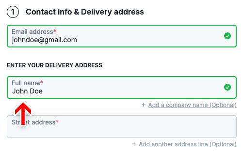
A single ‘Full name’ field instead of a First name and a Last name field
Users generally think of their name as a single entity and, therefore, a large proportion of users often type out their full name in ‘First Name’ field. Using a single “Full Name” field will at a minimum cut the number of form fields by one – a ~7% reduction.
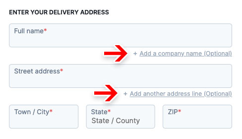
Optional fields are hidden behind a link
The main component in reducing the amount of needless attention drawn to optional fields is collapsing them behind a link. This performs well, as empty form fields in the checkout are generally seen by users as a potential task that has to be completed. Removing the form field from the default checkout flow will greatly reduce the amount of needless attention.
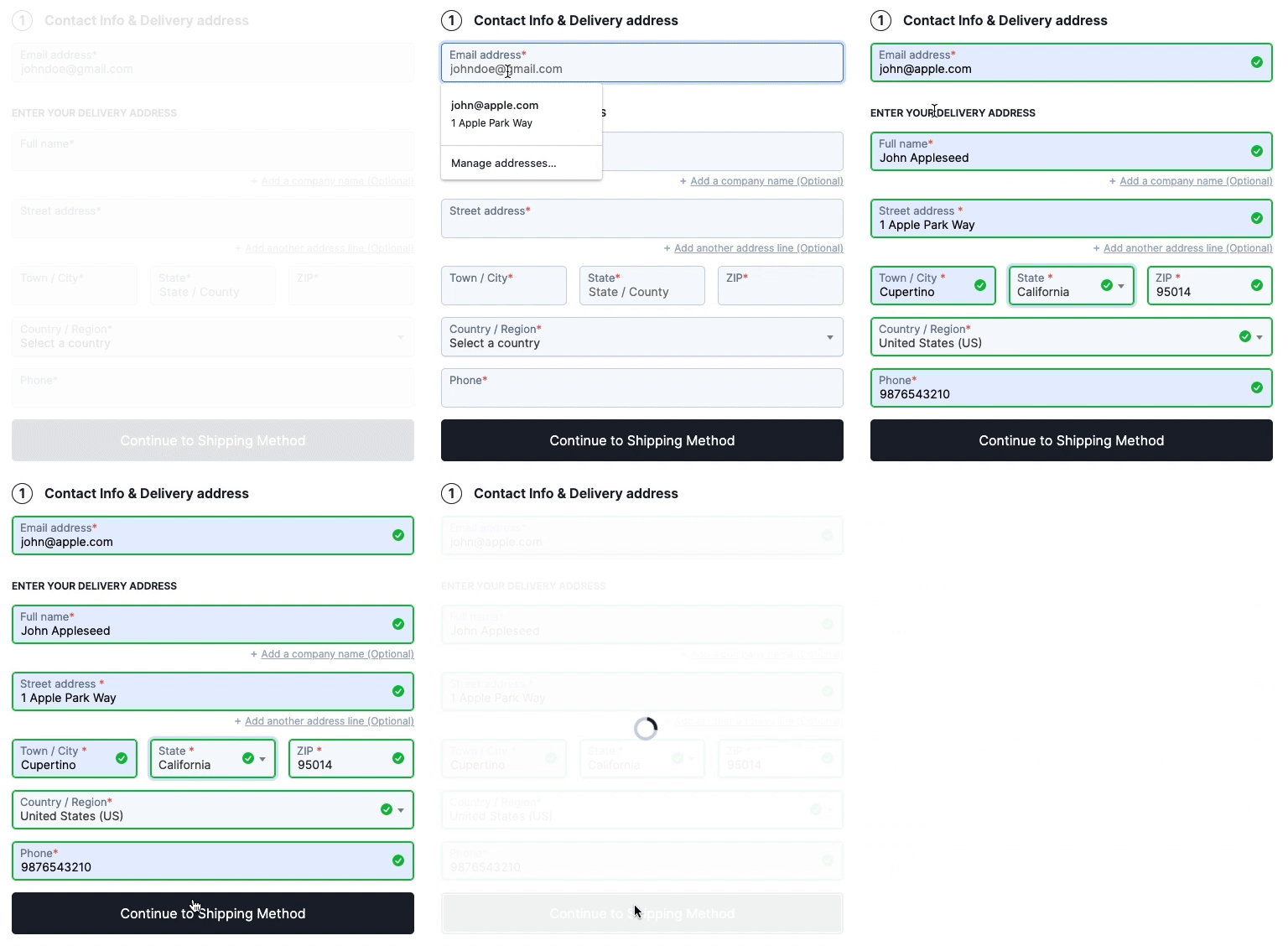
Browser auto-fill optimized
Browser auto-fill can make the tedious task of completing a form a breeze for users. Usability research by Google indicates that form completion time can be reduced by 30% on average when users are able to rely on browser auto-fill to pre-fill contact, address, and even credit card fields with past typed data.
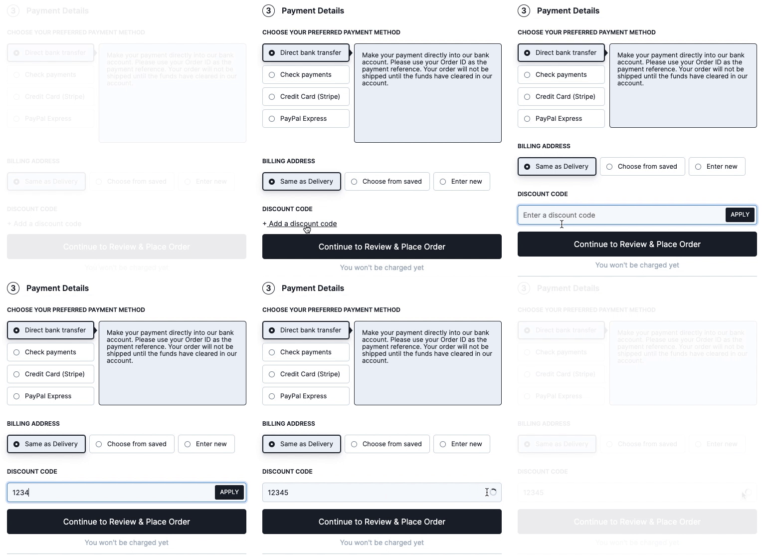
Coupon section is much less prominent
Showing a coupon code field and apply button directly in the checkout flow is one of the best ways to make sure all users without a coupon notice that they could be getting a better deal on their purchase.
With LCW, the coupon section is within the payment step where it actually belongs and hidden behind a link.
Express checkout compatible
The LCW checkout is fully compatible with Express checkout plugins from your favorite payment service providers.

Distraction-free 'Enclosed Checkout'
During the checkout process, the number of elements shown to users should be reduced to a minimum to allow them to focus on completing the checkout process. This, in particular, means removing the main site-wide navigation in the header and the various potentially distracting links in the footer during checkout.
Read this article for more on this.
Typed-in data is preserved for the whole checkout session
Filling out forms can be a time-consuming task and users will often find it tedious. When a user enters data into a form, every effort should be made to preserve that data. That's why everything users type is saved in the browser's local cache and will be preserved even on page reload.


Delight users with a thoughtful checkout flow
Besides speeding up the completion of the form, a thoughtfully designed checkout flow has the potential to bring delight to users in an otherwise dull typing process.
Live inline error validation of form fields
“Live inline validation” is where the validity of the user’s inputs are checked live as the user progresses through the form, as opposed to checking the inputs in a lump sum when the user submits the form.
We time and again observe that there’s a direct correlation between how and when users are presented with form validation errors and the pace and effort with which they are able to resolve those errors.

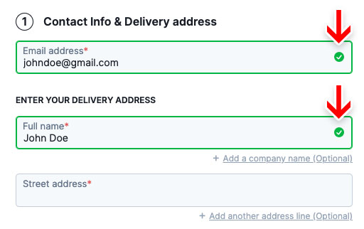
Positive inline validation
It has been observed to perform well that instead of only telling users what they’ve done wrong, we also tell them when they’ve done something right. During testing, sites that used positive inline validation, by adding a checkmark next to correctly inputted values, added a sense of delight and progression to the whole typing experience.
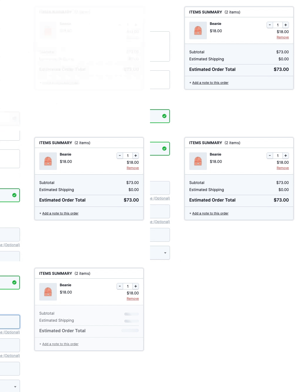
Sticky Order Summary
As your customer scrolls down and advances through the checkout, a persistent view of a summary of the cart is helpful for ongoing review of changes in price values due to their typings and selections.
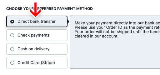
Tabbed payment methods selector with default selection
Unlike WooCommerce's nested payment method selector, which pushes down subsequent options when an option is selected, the tabbed design allows for proximity with all options while allowing a default option to be selected.
Read more about our payment method selector.


Before finding this plugin, I already knew the Baymard Institute’s UX studies for e-commerce (studies that guided the development of this plugin), but until now I was limited to manually applying few optimizations that other plugins would allow. It is amazing that Linear Checkout applies all this knowledge, along with a beautiful design and fast and responsive technical support. Perfect!"
Reduce shoppers’ cognitive load
Making users think, evaluate or make up their mind during the checkout causes interruptions. Since these interruptions lapses a user’s ability to progress in their checkout, it’s important to reduce them to any extent possible.
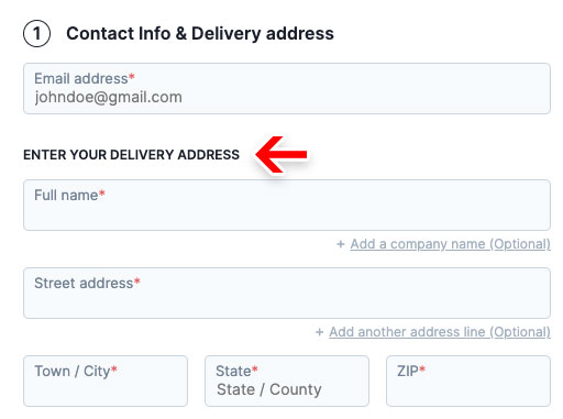
Let users enter their ‘Delivery Address’ first instead of ‘Billing Address’
A delivery address determines where the product is being delivered – a straightforward terminology which users have no issues understanding. A billing address, on the other hand, can be used for several purposes. Asking users to type their shipping address instead of a billing address performs better.
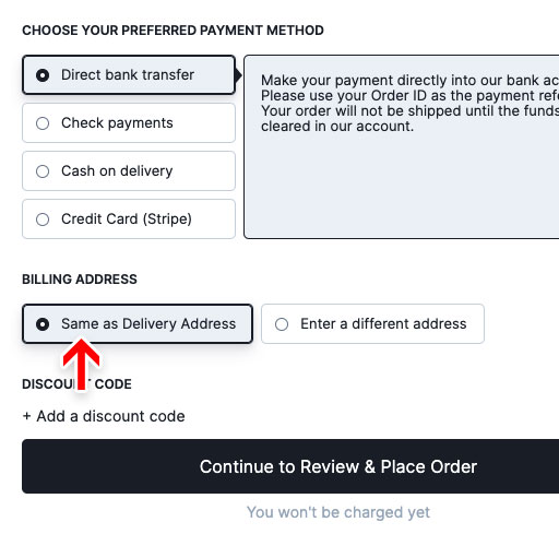
‘Billing Address’ is same as ‘Delivery Address’ by default
For most B2C sites, the majority of customers typically order products to their own address. Setting the “Billing Address to equal the Delivery Address”, by default, performs vastly better than either not having the feature or not having it as a default selection.
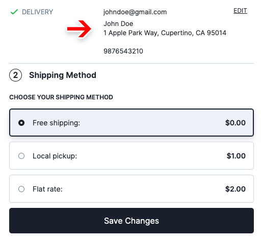
Summary of prior completed step for ongoing review
As your customers submit each step, it collapses into a summary of their typings and selections that encourages ongoing review. Spotting and correcting errors early on, while still fresh in memory, is easier than having to review all steps and correct errors together at the end.
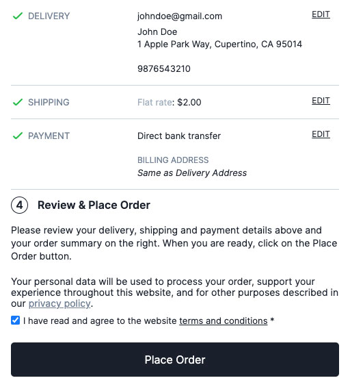
Review step optimized for skimming
The review step is optimized for your customer to skim through their information quickly and proceed with placing their order.
Mobile-first checkout, built from the ground up.
Mobile e-commerce traffic has exploded recently, and now frequently constitute 40-60% of all traffic to many e-commerce sites. A study by the Baymard Institute shows that 43.2% of all smartphone or tablet users have abandoned an online order during the checkout flow.
That’s why we built the mobile-first checkout flow from the ground up based on 55 mobile-specific guidelines to offer the best mobile checkout experience ever.
Have questions?
Is it translation ready?
Yes. You can translate all strings using the Loco Translate plugin.
Is this compatible with my theme?
Yes. This plugin works independently of your theme and will not be affected by your theme’s styles. If you face any issues with your theme, send us an email to [email protected] and we’ll get it fixed asap.
Can I style the checkout to better reflect my brand and website’s theme?
Absolutely. You have full CSS control over all aspects of the checkout page. We also provide a custom-styled checkout service to help you make your checkout completely your own. See a custom-styled checkout.
Why are my store’s header, navigation, sidebar and footer not included?
Read this article to know more about Enclosed Checkout and why leading e-commerce sites, including Amazon, use it.
What payment gateways do you support?
We have developed the plugin in such a way that most payment gateways work out-of-the-box. The plugin simply uses existing payment methods that you have already set up. In other words, if it works with the default checkout, it’ll work with the plugin. If you face any issues with your payment plugin, let us know at [email protected] and we’ll fix it immediately.
Will it work with my shipping plugin to calculate and display shipping rates from carriers?
We have developed the plugin in such a way that most shipping plugins work out-of-the-box. If you face any issues with your shipping plugin, let us know at [email protected] and we’ll fix it immediately.
How can I report a bug?
If you think you have identified a bug or a compatibility issue, send us a Bug Report using the link inside the plugin settings.
How can I request a new feature?
You can use the ‘Request a feature’ link inside the plugin settings. It will send you to our idea management platform where you can post, vote on and discuss about your idea and other ideas from other users as well.
How can I get support?
For anything other than bugs, compatibility issues and feature requests, send us an email at [email protected]
Our laser-focus is on improving the checkout flow to maximise conversion. We are working on premium features ranging from minor but significant design improvements to major overhaul of systems to make it easier for users.
Want to go Pro?
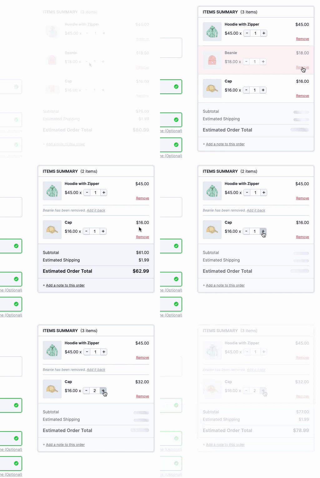
Live cart editing in checkout pagePRO
Allow your customers to change quantities, remove and re-add products directly on the checkout page without any page reloads. Bid goodbye to the hideous default WooCommerce cart page.

Google Address Auto-completePRO
Reduce post-order headaches and cut down address form fields by auto-completing your customers’ address entry.
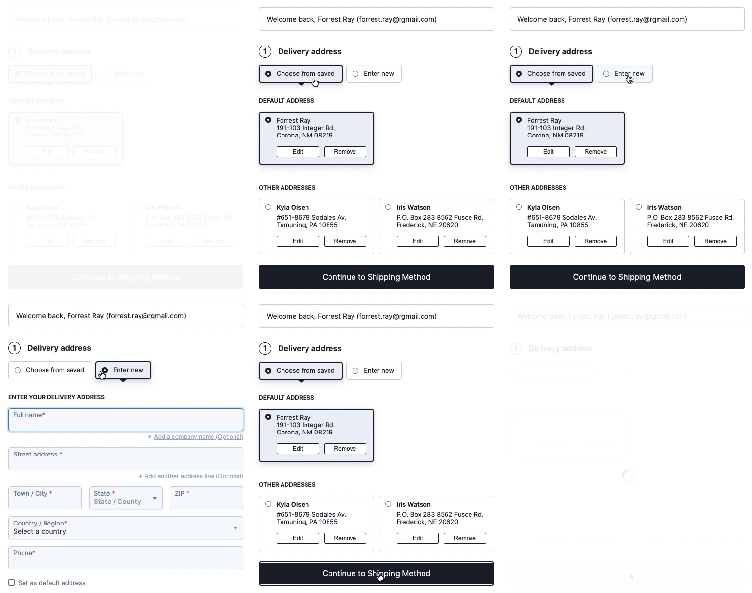
Saved Addresses for logged-in usersPRO
80% of people use the same address most of the time. Logged-in users can add multiple shipping and billing addresses during checkout, or pick from their previously saved addresses for both delivery and billing.
Your customers can choose a default address for delivery and billing, and it will automatically be selected during checkout.
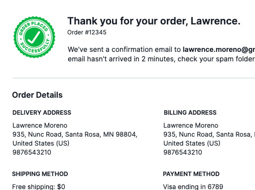
A Better Thank you pagePRO
The order confirmation page (thank you page) is the final leg in the checkout process. The first job of the confirmation step is to let users know that their order has been successfully completed. It’s important that this information is communicated clearly to users to avoid them looking for further tasks that have to be completed before the order is placed.
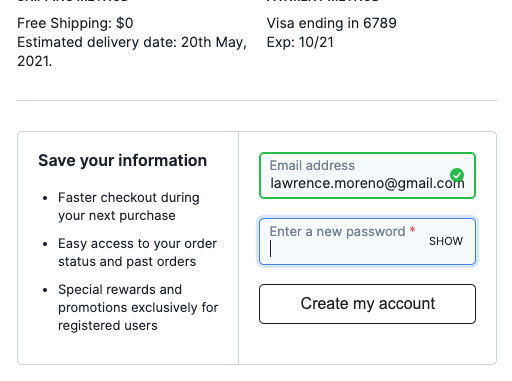
Delayed account creationPRO
While users should always be allowed to complete the checkout process as a guest, having an optional account creation option is often appreciated by users. This begs the question of at which point during the checkout flow is it best to ask for the optional account creation.
Based on previous checkout usability tests, it’s clear that delaying the optional account creation option performs the best. In fact, it’s often best delayed until the order is finalized; hence presenting the optional account creation option on the order confirmation page works best. This concept is called ‘Delayed Account Creation’.
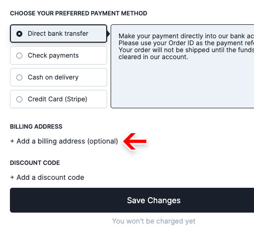
Hide or make billing address optional for virtual and downloadable productsPRO
For stores that do not need to get a billing address from their users, it is best to hide the form altogether.
Remove Cartimize brandingPRO
Remove the 'Checkout Powered by Cartimize' badge and make the checkout your own.

More Pro features coming soon...
A powerful drag-and-drop checkout field customizer with more than 15 custom checkout field types and more advanced options that gives you full control over your checkout form fields.
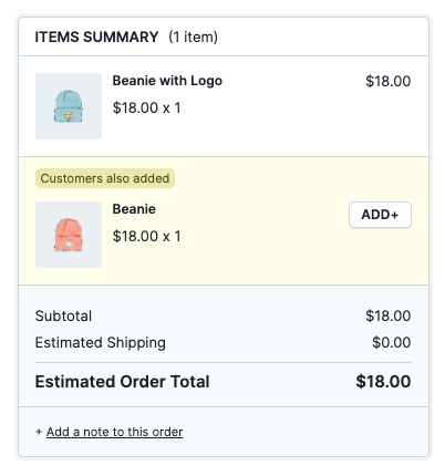
Increase your average order value by presenting an eye-catching yet non-interruptive upsell offer before your customers checkout. The offer is presented within the order items summary as a small widget where they can accept the offer by simply adding it to the cart.
Considering how easy it is to complete the mobile checkout process using a desktop computer instead, it is no surprise that a Baymard research study showed that 21% of mobile users consistently use a desktop device to complete their mobile-initiated orders, while 40% do it occasionally.
To support this behaviour, cart items are sync’d between the mobile and desktop checkout sessions for logged-in users.
While we can’t avoid requiring some information from users, we should minimize the amount of typing required whenever possible. Both “State” (/region) and “City” inputs present such an opportunity, as both can be auto-detected from a ZIP or Postal code in most countries.
The password reset flow is the weakest link of the checkout process. Any issues with the password reset process technically lock users out of their account, at which point abandonments are very likely.
OTP and link-based authentication via SMS and email, which were traditionally used only for 2-factor authentications can be used to completely eliminate the need for a password. Both account creation and logging in can be done through this system.
Users simply don’t want yet another account, for yet another site, with yet another password. 34% of shoppers abandon their carts when they are required to create an account. One easy way for users to create an account is to allow them to login with their social profiles. No more usernames, emails or passwords to enter and remember.
Even after adding a product to the cart and starting the checkout process, users can still be skeptical of their purchase. Reassuring them of their decision nudges them to complete the purchase.
One way to do this is to display the product-specific user reviews right in the checkout page itself. When a real customer tells them that the particular product worked well, chances are that they will feel confident to purchase it.
…and a lot more coming soon.
Pro plugin pricing
-
Use on 1 site$9999
per yearSTORE OWNER
-
Use on upto 5 sites$19999
per yearFREELANCER
-
Use on upto 50 sites$39999
per yearAGENCY
Expires in
Install the Free plugin above and we’ll onboard you to the Pro plugin and the 14-day free trial inside the WP admin dashboard. You can purchase a license after starting your trial.
Have questions about the Pro plugin?
Can I use my licence in a development environment?
Yes. Most development environments will not count towards your site limit. If you face any issues, reach us at [email protected]
Can I change the domain associated to the Pro license?
Yes. You can unlink websites and free up slots in the 'My account' page.
How do renewals work?
Your license will renew automatically every year for the original yearly price, unless you cancel it. If you cancel it during the year, your licence will still be valid for the paid-for period. Once expired, you will lose access to all Pro features and priority support.
What will happen if I do not renew my license?
You can continue using the free plugin, but you will not have access to Pro features and priority support. We highly recommend you to renew your license for uninterrupted access to Pro features and priority support.
Do you offer a trial of the Pro plugin?
Yes, we offer a full-featured, 14-day, free trial for you to test the plugin before purchasing it. Install the Free plugin and we'll onboard you to install the Pro plugin and start the trial.
Do you offer refunds?
Yes, your purchase is fully protected by our 14-day refund policy. If you decide within 14 days of purchase that our plugin is not for you, we’ll happily refund your payment.
I have a question not listed here.
You can reach us at [email protected]
Do you offer lifetime deals?
I'm sorry, we don't. We believe lifetime deals are not a sustainable business model for us. If we receive value from a product year over year, it makes sense to support its growth year over year.
We are in this for the long run and want to build a platform that you can rely on for years to come. If there’s one thing we've learnt over the years, it’s better to be a customer and service-oriented business than a deal, offer or discount-oriented one.
What is your normal support response time?
Your support requests' priority and response time depends on the license you hold. If we get swamped with more requests, the response time may increase for the Store owner and the Freelancer licensees. We strive to get you a resolution as quick as and with as less back and forth emails as possible.
| Your License | Normal response time |
|---|---|
| Agency | 12 business hours |
| Freelancer | 24 business hours |
| Store Owner | 48 business hours |
Still thinking?
There's a reason Cartimize found you today. The time has come for you to get the checkout you deserve. The question, however, is, are you willing to open the door when abundance knocks?
Get Support: [email protected]